Tag: Visualizations
-
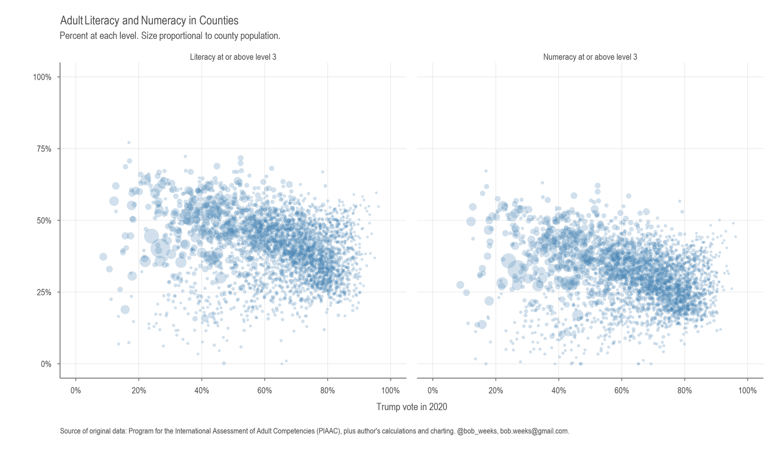
Adult Literacy and Numeracy in Counties
Analyzing literacy and numeracy rates in counties alongside political sentiment.
-
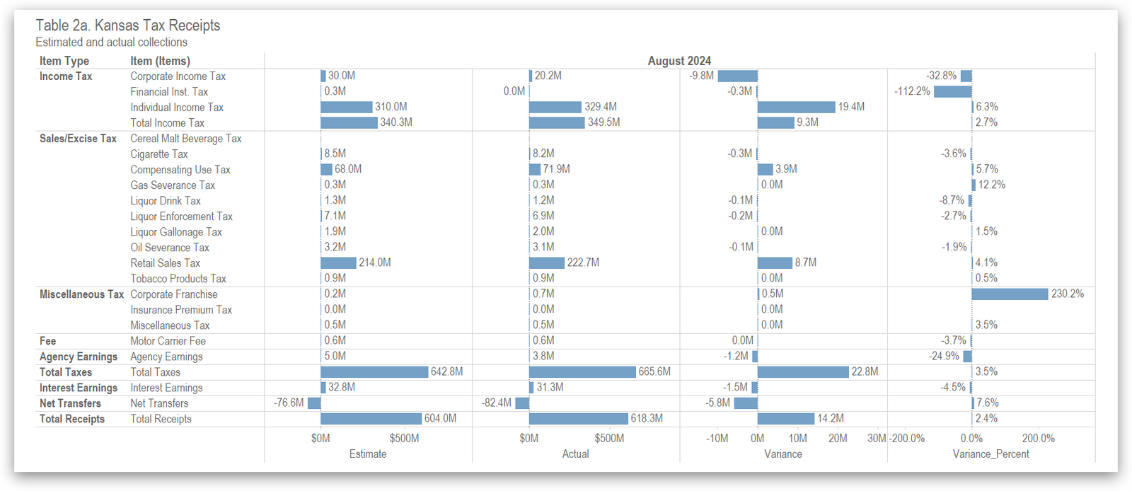
Kansas Tax Revenue, August 2024
For August 2024, Kansas tax revenue was 4.0 percent higher than August 2023, and 3.5 percent higher than estimated.
-
Kansas Tax Revenue, July 2024
For July 2024, Kansas tax revenue was 3.0 percent lower than July 2023, and 1.0 percent less than estimated.
-
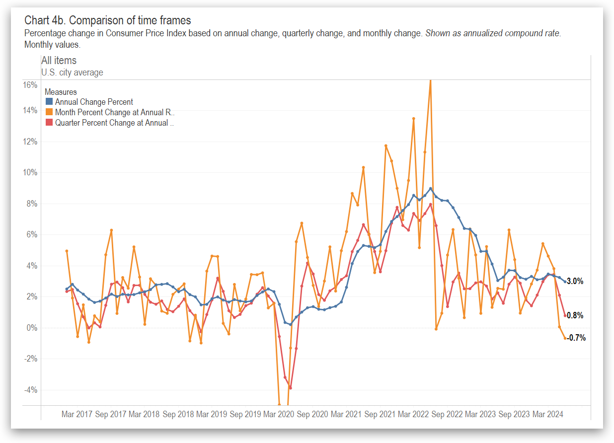
Inflation and Consumer Price Index, June 2024
Looking at inflation calculations in a different way.
-
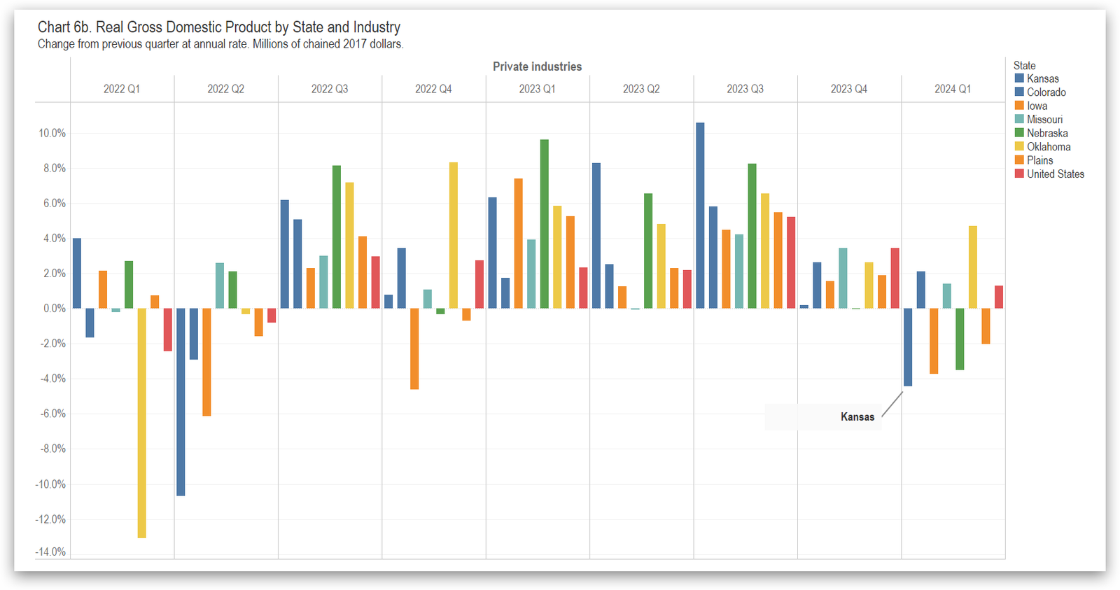
GDP in the States, First Quarter 2024
In the first quarter of 2024, the Kansas economy contracted at the annual rate of 3.9 percent. Real Gross Domestic Product increased in 39 states and the District of Columbia, ranging from 5.0 percent at an annual rate in Idaho to –4.2 percent in South Dakota. Kansas ranked forty-eighth.
-
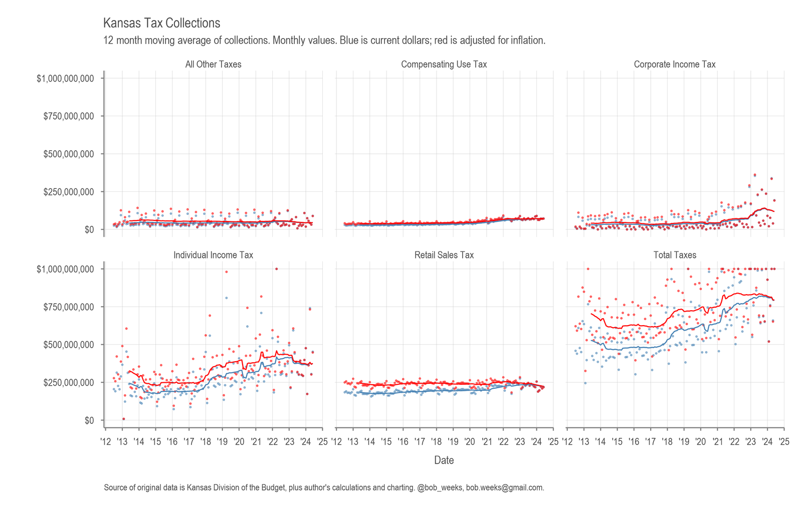
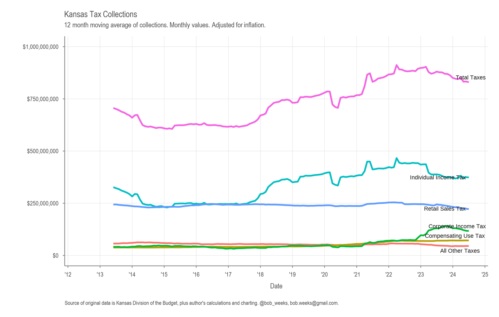
Kansas Tax Revenue, June 2024
For June 2024, Kansas tax revenue was 3.9 percent higher than June 2023, and 2.4 percent higher than estimated. For the just-completed fiscal year, collections were lower by 1.5 percent than the previous year, and 2.0 percent lower than estimated.
-

Unemployment Rates
All the unemployment rates published by Bureau of Labor Statistics in an interactive visualization.
-
Kansas Tax Revenue, May 2024
For May 2024, Kansas tax revenue was 23.1 percent lower than May 2023, and 22.7 percent lower than estimated.
-
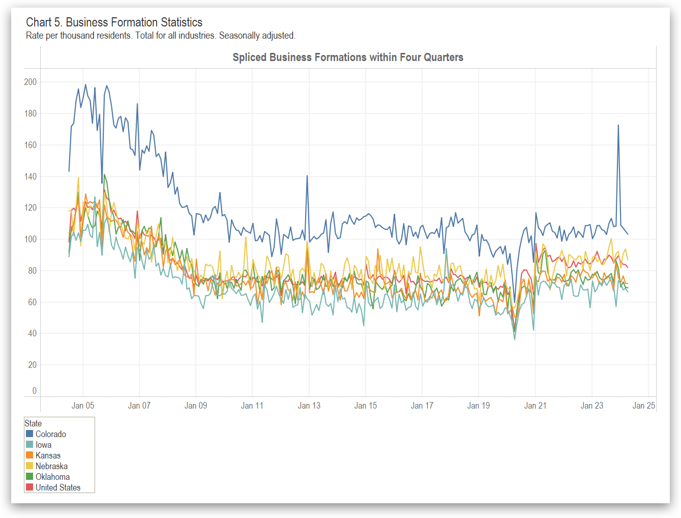
Business Formation in States
For both business applications and business formations, Kansas does better than some states, but lags many states and the nation.
-
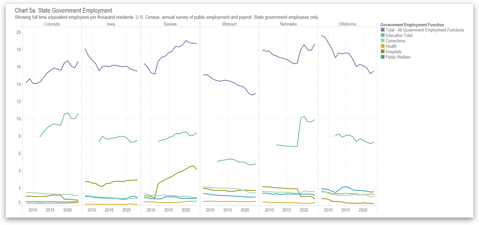
State Government Employees in Kansas and the States
Kansas has more state government employees per resident than most states. The trend is steady after rising.
-
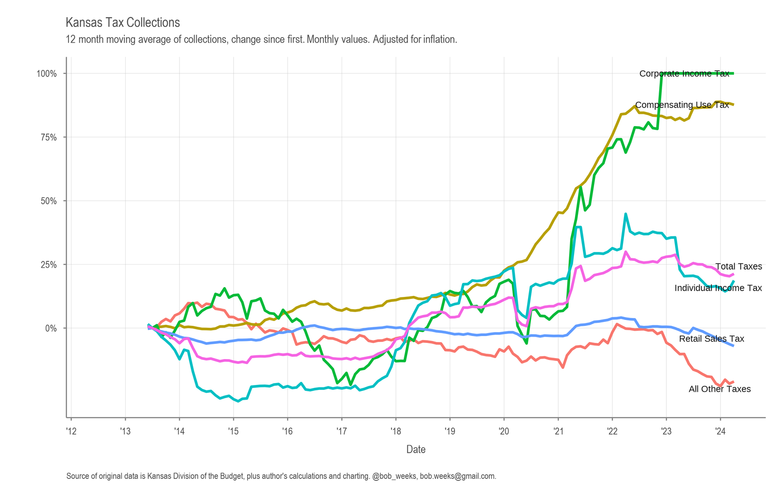
Kansas Tax Revenue, April 2024
For April 2024, Kansas tax revenue was 9.6 percent higher than April 2023, and 7.7 percent higher than estimated.
-
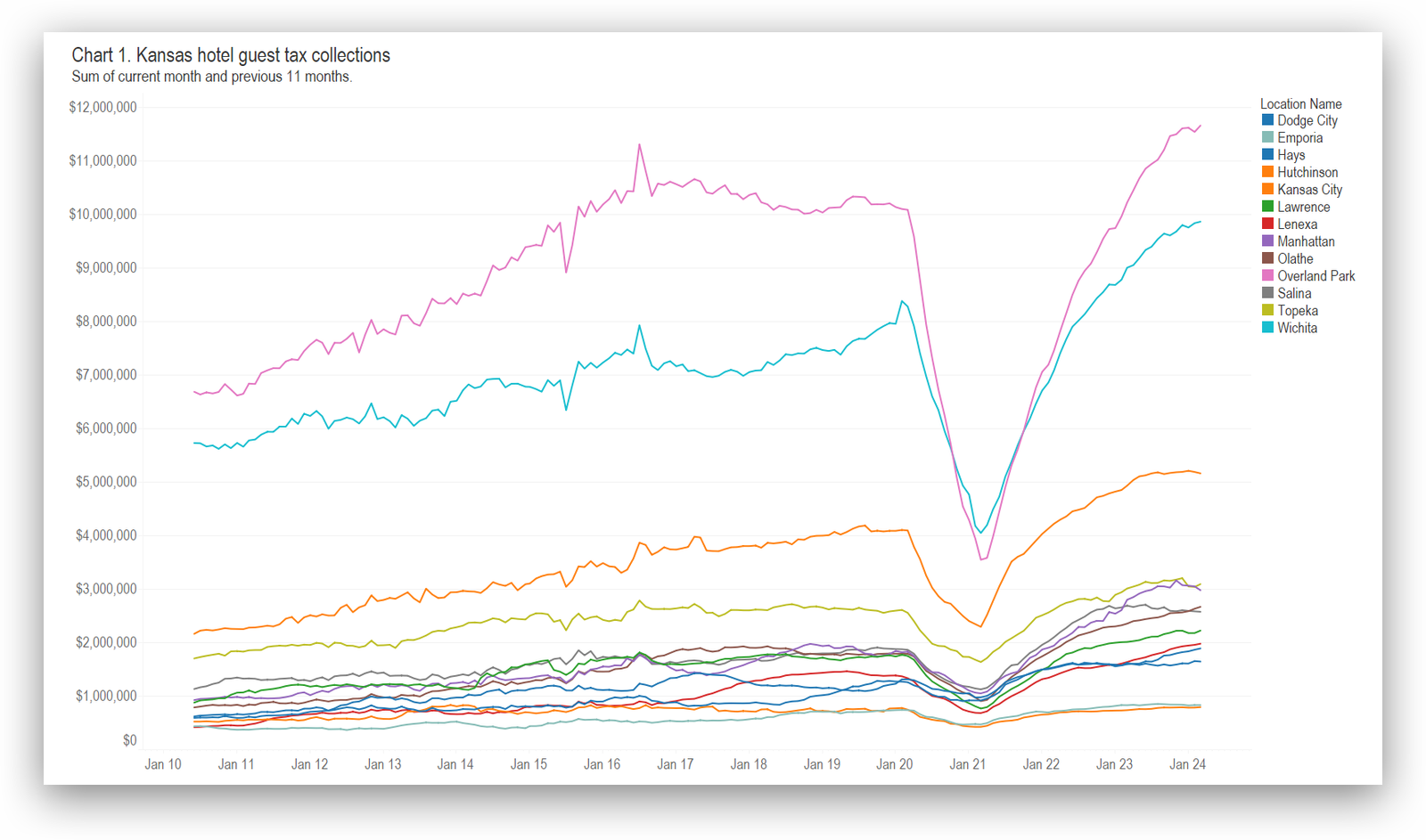
Updated: Kansas hotel guest tax collections
Kansas hotel guest tax collections presented in an interactive visualization. Updated with data through March 2024.