Tag: United States President

  • During the Trump administration, the economy grew

    During the Trump administration, the economy grew

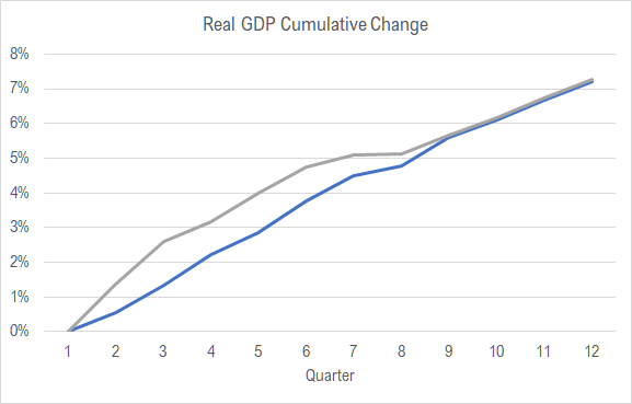
    The United States economy has grown since Donald J. Trump became president, until the pandemic. How does the growth compare with the previous administration?

    This chart holds plots of real gross domestic product (GDP) added over two periods of 12 quarters each. One line starts with the first quarter of 2017, which is the first quarter of the Trump administration. It ends with the fourth quarter of 2019, which is the last quarter that was not affected by the response to the pandemic.

    The other line starts with the first quarter of 2014 and covers the last 12 quarters of the previous president’s administration.


    Question. Which line belongs to each president’s administration?

    No matter which administration’s line is blue and which is grey, I think the conclusion we can make is that one president did a good job of maintaining the positive trend of his predecessor, and that’s a great accomplishment — for both presidents.

    In tabular form:

    This data is from Bureau of Economic Analysis, which is an agency of the United States Department of Commerce. This data is real GDP, meaning the dollar values are adjusted for the effects of inflation. The data is released quarterly, and it is not uncommon for the initial numbers to be revised. This is by far the most common source of GDP data for the United States and is extensively used.

    Which line belongs to each president? The answer is the blue line is Trump, and the grey line is Obama.

  • Updated: Presidential data explorer

    Updated: Presidential data explorer

    Explore the economic record of presidents through the lens of data, with new updates for August.

    To examine the record of presidents regarding economics, I gathered data from several sources and present it in an interactive visualization. Today the interactive visualization has been updated with jobs and Dow Jones data for the month of August.

    For each president, data is presented by month, with the first month of each president’s term having number one. Presidents that served two full terms have data up to month 96 of their term, while others have fewer months.

    Data is shown in several views:

    • A table.
    • A timeline chart showing the monthly value of a statistic by month for each president. There are two versions.
    • A chart showing the change in the absolute value of a statistic by month for each president.
    • A chart showing the proportional change in the value of a statistic for each president.
    • Grids of the same data.

    Click here to learn more about the data and access the visualization.

    Example from the visualization. Click for larger.
  • Libertarian campaign visits Wichita

    Libertarian campaign visits Wichita

    In Wichita Story, Tim O’Bryhim reports on the visit of the Libertarian Party vice presidential candidate to Wichita:

    “It is another hot August day in Kansas; a good day to be inside. But a crowd gathers in the (sadly only proverbial) shadow of the Keeper of the Plains to welcome Spike Cohen, the vice-presidential candidate of the third largest political party in the United States of America. If elections were the Olympics, the Libertarian Party would proudly climb on the medals stand every four years with a bronze medal around its neck. But in American politics, third place is almost always a distant finish.”

    Click on Libertarian VP Candidate Spike Cohen Rallies Wichita Supporters Amidst a Hostile Electoral System.

  • Added to presidential data explorer: Economic indexes

    Added to presidential data explorer: Economic indexes

    Explore the economic record of presidents through the lens of two economic indexes.

    To examine the record of presidents regarding economics, I gathered data from several sources and present it in an interactive visualization. Today, two economic indexes have been added.

    The Federal Reserve Bank of Philadelphia calculates two indexes that track and forecast economic activity in the states and the country as a whole. The coincident index is a measure of current and past economic activity for each state. The average value for the complete year 2007 is given the value 100. The leading index predicts the six-month growth rate of the state’s coincident index. Positive values mean the coincident index is expected to rise in the future six months, while negative values mean it is expected to fall. 1

    For each president, data is presented by month, with the first month of each president’s term having number one. Presidents that served two full terms have data up to month 96 of their term, while others have fewer months.

    Data is shown in several views:

    • A table.
    • A timeline chart showing the monthly value of a statistic by month for each president. There are two versions.
    • A chart showing the change in the absolute value of a statistic by month for each president.
    • A chart showing the proportional change in the value of a statistic for each president.
    • Grids of the same data.

    Click here to learn more about the data and access the visualization.

    Example from the visualization. Click for larger.


    Notes

    1. For more about these indexes, and for a visualization of these for each state, see Visualization: Economic indicators in the states.
  • Added to presidential data explorer: Primary Energy Net Imports

    Added to presidential data explorer: Primary Energy Net Imports

    Explore the economic record of presidents through the lens of energy independence.

    To examine the record of presidents regarding economics, I gathered data from several sources and present it in an interactive visualization. New to the visualization is Primary Energy Net Imports. When this number is negative, it means the United States is exporting more energy than it imports. This data comes from the U.S. Energy Information Administration.

    Primary energy is “Energy in the form that it is first accounted for in a statistical energy balance, before any transformation to secondary or tertiary forms of energy. For example, coal can be converted to synthetic gas, which can be converted to electricity; in this example, coal is primary energy, synthetic gas is secondary energy, and electricity is tertiary energy.”

    For each president, data is presented by month, with the first month of each president’s term having number one. Presidents that served two full terms have data up to month 96 of their term, while others have fewer months.

    Data is shown in several views:

    • A table.
    • A timeline chart showing the monthly value of a statistic by month for each president. There are two versions.
    • A chart showing the change in the absolute value of a statistic by month for each president.
    • A chart showing the proportional change in the value of a statistic for each president.
    • Grids of the same data.

    Click here to learn more about the data and access the visualization.

    Example from the visualization. Click for larger.
  • Added to presidential data explorer: Mortgage rates

    Added to presidential data explorer: Mortgage rates

    Explore the economic record of presidents through the lens of mortgage interest rates.

    To examine the record of presidents regarding economics, I gathered data from several sources and present it in an interactive visualization. New to the visualization is the 30-year fixed-rate mortgage average in the United States, not seasonally adjusted.

    For each president, data is presented by month, with the first month of each president’s term having number one. Presidents that served two full terms have data up to month 96 of their term, while others have fewer months.

    Data is shown in several views:

    • A table.
    • A timeline chart showing the monthly value of a statistic by month for each president. There are two versions.
    • A chart showing the change in the absolute value of a statistic by month for each president.
    • A chart showing the proportional change in the value of a statistic for each president.
    • Grids of the same data.

    Click here to learn more about the data and access the visualization.

    Example from the visualization. Click for larger.
  • Consumer sentiment index by presidential term

    Consumer sentiment index by presidential term

    For many years the University of Michigan as published a survey of consumers, with one output being a consumer sentiment index. More information about the index can be found here.

    I’ve gathered this data and present it in two ways. One is through my interactive visualization Presidential Data Explorer.

    The second way is via an animated chart, presented below. The horizontal index is the number of months into each presidential term. This animation stops at the first term.

    Use the animation below, or click here to open in a new window.

  • Dow Jones by presidential term

    Dow Jones by presidential term

    An animated chart of the Dow Jones Industrial Average for each month of a presidential term.

    To help evaluate the performance of presidents in growing the economy, here is an animated chart of the Dow Jones Industrial Average for each month of a presidential term. The performance of the stock market is not the same as the performance of the economy, and the DIA is not a broad measure of the performance of stock markets. Nonetheless, it is often cited.

    The base data in this chart is the average daily close for all days in a month. Then, I compute the percentage change by month since the start of each presidential term. Data is through July 2020. Data is shown for the first term of presidents.

    Use the visualization below, or click here to open it in its own window. Hovering over any line will highlight it so it stands out from others.

    This chart can help evaluate claims presidents and their supporters make. Find more data like this in the Presidential data explorer. This interactive visualization contains other data like jobs, unemployment, GDP, and inflation. You can learn more about the visualization and use it here: Visualization: Presidential data explorer.

  • Herman Cain, RIP

    Today we learned that Herman Cain has died at the age of 74. He had been hospitalized with COVID-19, according to a statement on his website.

    He was an interesting man. In 2010, as he was rising in national prominence, I interviewed him in his hotel suite in Las Vegas. He ran for president in 2012.

    For my interview, click on Herman Cain: Conservatives should dream, be united, informed, inspired.