Tag: Barack Obama
-

Trump’s Obama Ape Video: Fact-Checking the Truth Social Controversy
President Trump’s Truth Social account posted a video depicting Barack and Michelle Obama as apes on February 5, 2026. This fact-check separates verified facts from disputed claims about who posted it, whether Trump saw it, and what it reveals about racism in American politics.
-
Trump, Biden, Obama Votes
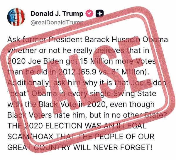
In this statement attributed to Donald J. Trump, he asserts that Joe Biden received 15 million more votes in 2020 than Barack Obama did in 2012 (81 million vs. 65.9 million). Trump further claims Biden “beat” Obama in every swing state among Black voters despite those voters supposedly “hating him,” concluding that the 2020 election…
-
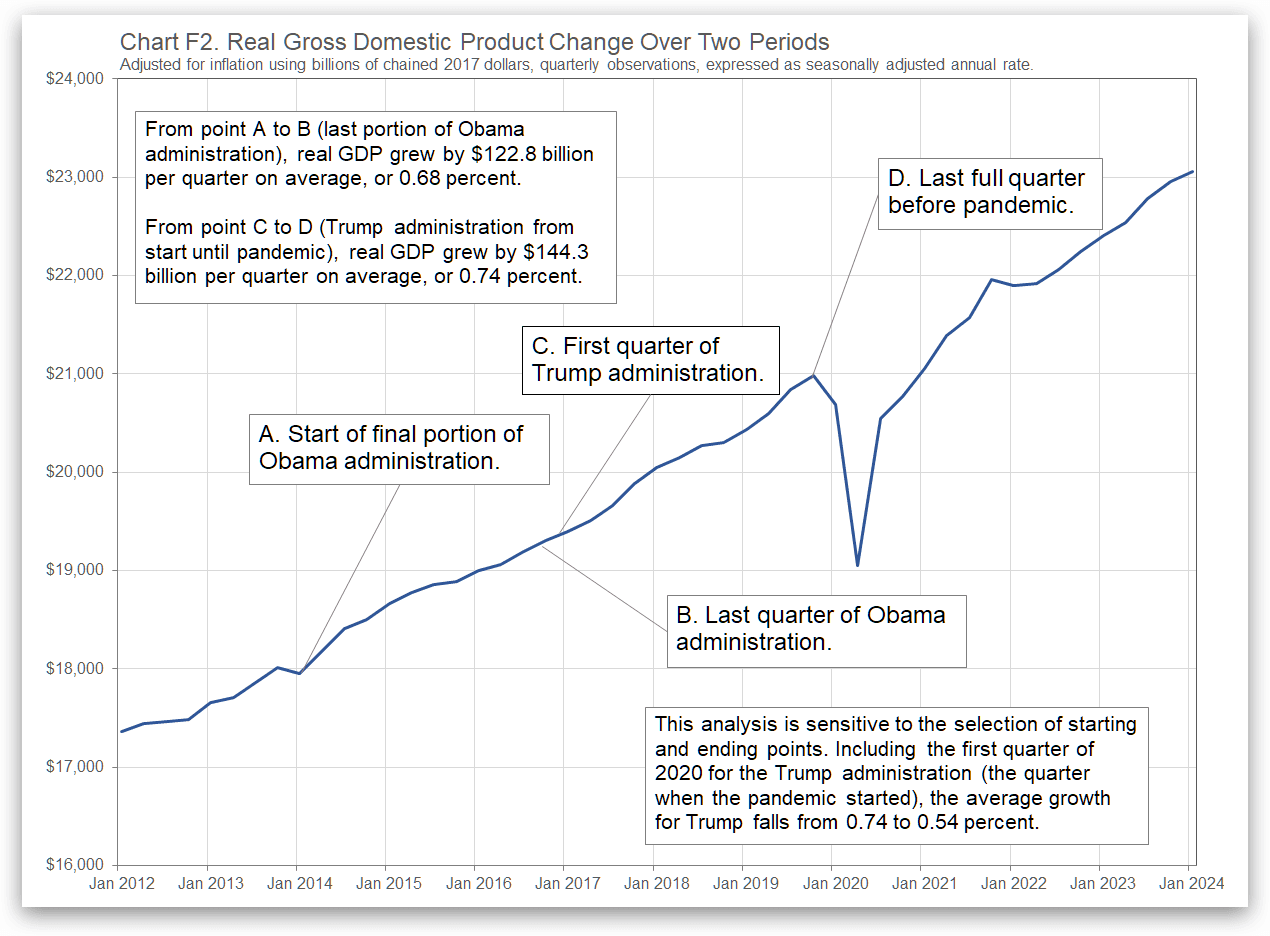
Comparing Obama and Trump Economies on Growth
The United States economy grew while Donald J. Trump was president, until the pandemic. How does this growth compare with the previous administration?
-
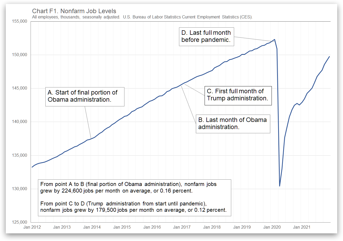
Comparing Obama and Trump Economies on Jobs
Many jobs were gained during the Trump administration until the pandemic struck. How did this growth compare to the prior administration?
-
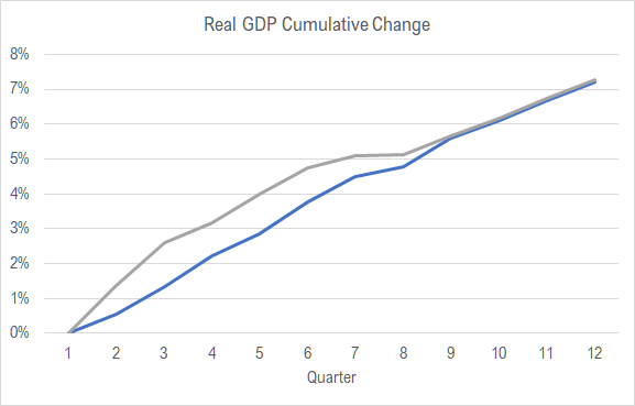
During the Trump administration, the economy grew
The United States economy has grown since Donald J. Trump became president, until the pandemic. How does the growth compare with the previous administration?
-

The Trump record on job creation
The United States economy has created many jobs since Donald J. Trump became president. How does the record compare with the previous administration and others?
-

Partisan Conflict Index
Have you suspected that the country has become more partisan? An index supports that.
-
Before pandemic, Trump economy created jobs
There is no doubt that the United States economy has created many jobs since Donald J. Trump became president. How does the record compare with the previous administration?
-
Trump economy continues to grow
There is no doubt that the United States economy has grown since Donald J. Trump became president. How does the growth compare with the previous administration?
-

Trump economy creates jobs
There is no doubt that the United States economy has created many jobs since Donald J. Trump became president. How does the record compare with the previous administration?