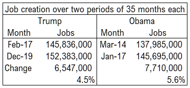
There is no doubt that the United States economy has created many jobs since Donald J. Trump became president. How does the record compare with the previous administration?
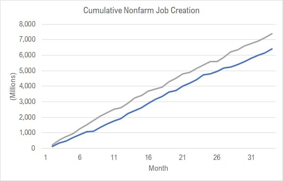
This chart holds plots of cumulative nonfarm jobs created over two periods of 34 months each. One line starts with February 2017, the first full month of the Trump administration. It ends with November 2019.
The other line starts with April 2014, which covers the last 34 months of the previous president’s administration.
Question: Which line belongs to each president?
No matter which administration’s line is blue and which is grey, I think the conclusion we can make is that one president did a good job of maintaining the positive trend of his predecessor, and that’s a great accomplishment.
Some ask why the chart doesn’t being with the first 34 months of the Obama administration. It’s a reasonable question. The answer is the two periods of time are not very comparable, as Obama took office during a recession, while Trump benefited from an already-growing economy — as the chart illustrates.
This data is from Bureau of Labor Statistics, which is part of the United States Department of Labor. The data series is CES0000000001, described as “All employees, thousands, total nonfarm, seasonally adjusted.” It is produced each month as part of the Current Employment Statistics survey. It is the most commonly cited employment series that is released monthly.

