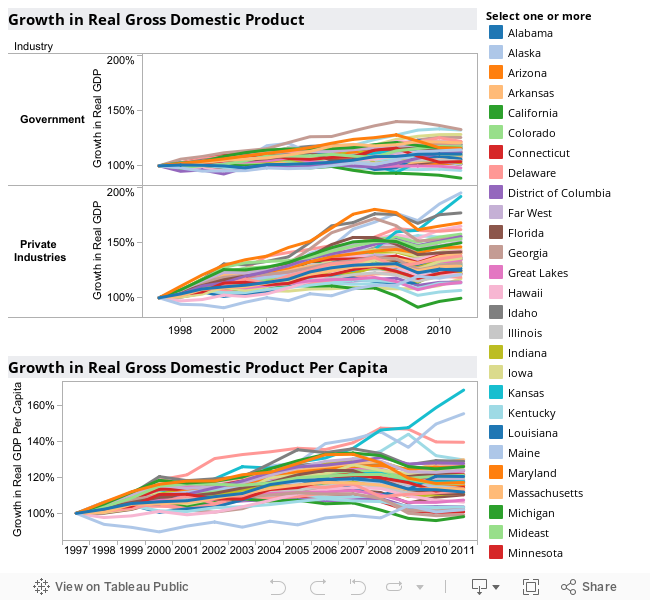
Here’s an interactive visualization that illustrates the growth in Gross Domestic Product by state and region. Dollar amounts are in chained 2005 dollars to eliminate the effects of inflation. Each state or region is indexed to start at 100% so we can see the relative rates of growth.
The top two charts show the growth in GDP for government, and then for the private sector. The bottom chart shows growth in GDP per capita (per person).
Click to highlight one or more states or regions to make its line stand out from the others. Use Ctrl+Click to add or subtract other states and regions. Use the visualization below, or click here to open in a new window.
Data from U.S. Bureau of Economic Analysis (BEA). Visualization created by myself using Tableau Public.
Leave a Reply