Examining the economy of metropolitan areas in an interactive visualization. Wichita examples included.
This interactive visualization presents annual gross domestic product (GDP) by industry for Metropolitan Statistical Areas. The source of the original data is Bureau of Economic Analysis, an agency of the United States Department of Commerce. I’ve gathered this data, performed some calculations, and present it in an interactive visualization.
GDP is the measure of total economic output, and is a primary measure of the health and performance of an economy. GDP is so important that recessions are defined as a fall in GDP.
BEA provides these values as real dollars, meaning adjusted for inflation. Data ranges from 2001 to 2020. I also incorporate BEA’s metro population estimates to produce per capita values.
One of the calculations I performed is determining the difference between the value for a metro and the nation. The most useful of these is the difference in per capita GDP between a metro and the nationwide value. If this value is zero, the metro produces at the same rate, per person, as the nation. This lets us place values in context: If per capita GDP for a county is $55,685, what does that mean? The value for the Wichita metro in 2020 was $49,416, so Wichita is below the nation. Its difference is -$6,269.
In 2020, GDP for the nation was $18,384.7 billion, measured in 2012 dollars. That was down from $19,032.7 billion the prior year. In 2020, GDP per capita was $55,685, also down from 2019, when it was $57,933. (1)These values differ slightly due to methods of classifying industries.
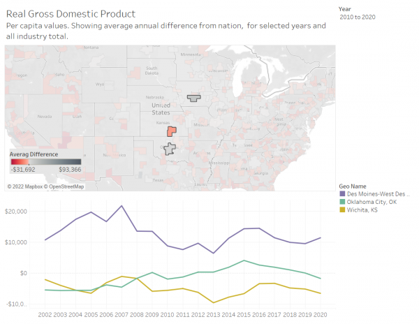
In these examples taken from the visualization, I present data for the Wichita metropolitan area and some others. (Click for larger versions.) Some are nearby metros, and some, like Pittsburgh, Greenville, and Chattanooga, are metros that Wichita leaders have visited in learning expeditions.
Chart 1c makes three presentations:
- The difference from the nationwide value for per capita GDP for each metro
- Total GDP for each metro
- Total GDP growth for each metro
Controls allow for sorting the counties in several ways, selecting years, and selecting an industry.
From Table 3, we see the strengths and weaknesses of the Wichita metro area. The first example shows GDP per capita (difference from nationwide) for all industries. The second is for manufacturing only, and it shows Wichita’s strength.
Other examples allow selecting from maps. In particular, note the map comparing Wichita with Des Moines.
To access this interactive visualization, click here.
References
| ↑1 | These values differ slightly due to methods of classifying industries. |
|---|


Leave a Reply