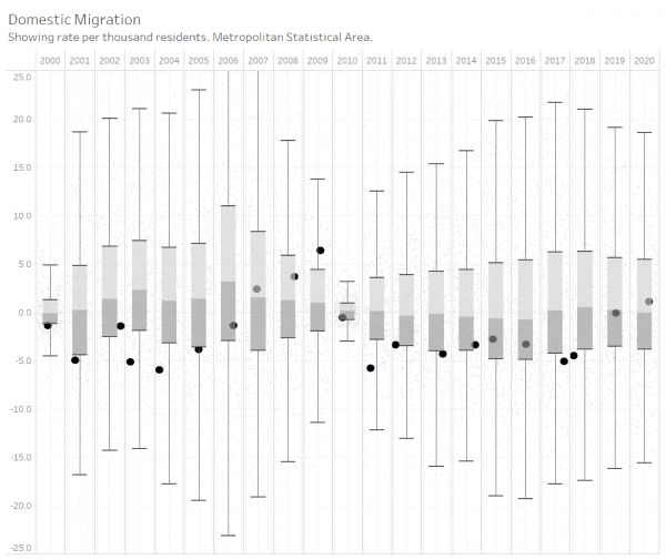
The Wichita metropolitan area often suffers from negative domestic migration, but in 2020 domestic migration was positive.
 Each year the United States Census Bureau provides estimates of the population of geographies. It also produces estimates of change due to natural causes such as birth and deaths, and movement due to migration. An important number is net domestic migration, which compares the number of people moving into an area to the number leaving. I’ve gathered the data and created an interactive visualization.
This visualization contains a chart called a box plot, showing, for each year, the distribution of domestic migration rates, with each dot representing a metropolitan statistical area, in this case. (1)Also called a box-and-whisker plot. The box for each year shows the interquartile range, which is the range in which half the values appear. The dividing line between the light and dark portions of the box is the mean. The verticle “whiskers” extend to horizontal lines that represent 1.5 times the interquartile range. Anything outside the range of the whickers is commonly called an outlier. In the second version of the plot, I highlighted the Wichita metropolitan area for emphasis. In it and the other charts, we can see that Wichita often has a negative domestic migration rate. An exception was the years 2007 to 2009.
Now, Wichita has a positive domestic migration rate. In 2019 the negativity was minor, and in 2020 the rate turned positive. The net domestic migration for 2020 was 703 persons, for a rate of 1.1 per thousand population.
Other examples from the visualization show Wichita compared to nearby areas. The interactive visualization holds data for metropolitan areas and counties, with changes due to births, deaths, and migration. To use it, click on Visualization: Population of Metros and Counties with Components.
Click charts and tables for larger versions.
References
| ↑1 | Also called a box-and-whisker plot. The box for each year shows the interquartile range, which is the range in which half the values appear. The dividing line between the light and dark portions of the box is the mean. The verticle “whiskers” extend to horizontal lines that represent 1.5 times the interquartile range. Anything outside the range of the whickers is commonly called an outlier. |
|---|


Leave a Reply