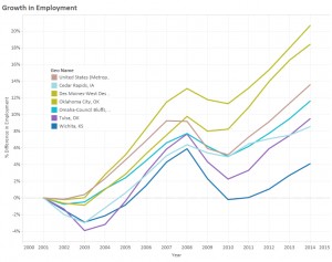
An interactive visualization of employment in metropolitan areas.

In the nearby example we can see that Wichita –- the bottom line — has performed poorly compared to some peers of interest.
Click here to access the visualization.
An interactive visualization of employment in metropolitan areas.

In the nearby example we can see that Wichita –- the bottom line — has performed poorly compared to some peers of interest.
Click here to access the visualization.
Leave a Reply